

Introduction about colour
Do you know why the sky is blue? Is it really blue, or do we just see it that way? Colour is one of nature's most intriguing and captivating phenomena. From the vibrant hues of sunrise or sunset, to the subtle nuances of a master painting. To understand more and better the complexity of colours, it is necessary to recapitulate on their definition, as well as the theory of colour and all the details behind it.
COLOUR THEORY
It can be defined as an interdisciplinary field that explores how we perceive and experience colour in different contexts, including art, science, design and psychology. This theory studies its physical properties, its perception by the human eye, different colour patterns, harmonies and contrasts, and much more. But before we get into it... Do you know what exactly colour is and where it comes from?
The first notions of colour date back to 1665, when Isaac Newton, the English physicist and mathematician, defined it as a combination of light and dark, with pure black being the absence of light and pure white the maximum value of luminosity. He demonstrated, experimentally, that white light is what gives rise to colours, as it was broken down into them thanks to the properties of refraction. To do this, he used a beam of light and a refracting prism through which the light would pass, breaking down into the spectrum of colours visible to the human eye.

However, he also observed that this was not true for all objects, since some opaque objects absorbed some colours instead of reflecting all of them. In other words, when we look at a red surface, it is really a surface with a pigment that absorbs all the colours contained in white light, except red, which is reflected, captured by the human eye and decoded by the brain as red.
Therefore, colour is a manifestation of visible light rays; that is, a set of electromagnetic waves that are within a spectrum perceptible by the human eye and that interact with objects by reflecting only some of these waves.
To answer the initial question, the blue sky is the result of the incision of sunlight in the Earth's atmosphere. Blue light has a shorter wavelength and is more easily scattered by gas molecules in the atmosphere.
However, colour is not only a physical property of light, but also a perceptual experience, as our eyes and brain interpret the wavelengths of light to create a rich palette of colours that we perceive around us.
Colour properties, attributes and models.
To talk about colour is also to talk about tones or shades, luminosity and saturation. The first is what allows us to differentiate one colour from another, that is to say, it is the colour itself. In turn, colours can have various degrees of saturation, i.e. the degree of purity or intensity. A highly saturated colour is one that is completely free of any grey tinge and is as pure as possible; however, a desaturated colour contains a mixture of grey, which reduces its intensity and makes it appear duller or ‘washed out’. Higher saturation means more vibrant and brighter colours, while lower saturation produces softer and subdued colours, which can provide various desired effects in works. On the other hand, there is luminosity, i.e. the brightness or intensity of light emitted or reflected by a colour. It is the perception of how light or dark a colour is in relation to white, which represents maximum brightness, and black, which represents the absence of light. A high lightness indicates that a colour is lighter and brighter, while a low lightness indicates that a colour is darker and duller.
There are also various colour models, which are defined as abstract systems used to represent and organise colours in a structured way. This is especially useful in artistic disciplines where working with precise colours is required. The most common are the RGB Model (Red, Green and Blue), used in digital workspaces; the CMYK Model (Cyan, Magenta, Yellow and Black) used in physical print formats; and finally the HSL Model (Hue, Saturation and Lightness) based on human perception of colour.
The chromatic circle
Returning to the concept of colour theory, it can also be defined as the set of rules or basic guidelines with which to mix colours and thus achieve various tones, shades or desired effects. In order to understand and represent both the discoveries and these rules, the chromatic circle, a fundamental tool in the study of colour, guides us through the relationship between the different colours.
The concept we know today is the result of several centuries of research and attempts to represent colour in many formats and forms by great thinkers and scientists.
From prehistory, Antiquity and the Middle Ages, approaches to colour and theories about them have been developed by great classical thinkers such as Aristotle (384 - 322 BC), the Arab philosopher and scientist Al-Kindi or the great Leonardo Da Vinci (1452-1519). Some of these theories were based on studying and organising colours from an approach centred on symbolism, perception and matter. Most of them conclude, with great Aristotelian influence, in the theory of the four elements, where colour is an inherent property of objects and is related to the four elements of the universe (earth, water, air and fire), thus proposing that the whole set of colours is shaped through these four.
However, it was not until the 17th century that the first graphical representations were recorded, thanks to Isaac Newton, who, from a more scientific and empirical approach, drew by his own hand a circular diagram showing the decomposition of light into 6 colours (named in Latin) derubeus, aureus, flavus, viridis, cœruleus, indicus and violaceus, which correspond to red,
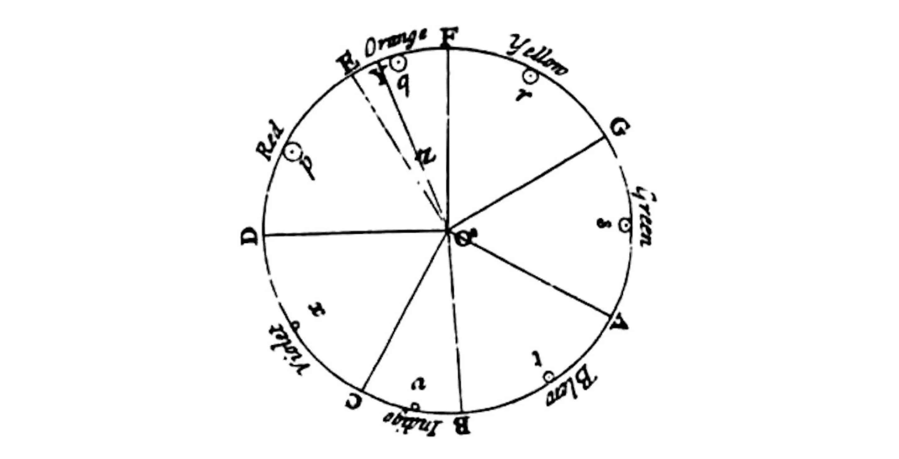
A century later, the first equidistant colour circle was made in 1776 by the engraver Moses Harris, with 18 fundamental shades.

The German scientist Johann Wolfgang von Goethe, in his work ‘Theory of Colours’, proposed his own colour circle based on subjective and philosophical observations of colours. His approach focused on the emotions and psychology of colour rather than physics, and he made a new symmetrical colour wheel, placing these primary colours opposite their complements

On the other hand, Tobias Mayer proposed in the 18th century a colour system that arranged the shades in a triangle. This astronomer placed the primary colours (red, yellow and blue) at each corner of the shape. The rest of the triangle was filled with progressive hexagonal gradients of the three colours. He managed to create 12 gradations between any two colours, which he believed was the maximum degree of variation that the human eye could distinguish.

The painter Philip Otto Runge in 1807 created a model that combined Mayer's three primary colours together with black and white, spreading them over a three-dimensional globe with cross-sections.

It was at the German school of arts and crafts, the Bauhaus, that two of its masters refined modern colour theories, each creating his own geometry: Johannes Itten and Paul Klee. The former published The Art of Colour, which produced the first star based on Goethe's polarity of colours. The latter, in turn inspired by Runge's triangle, succeeded in transforming colour from static to movement

The history of colour circles reflects the evolution of human thinking about colour, from early observations to modern scientific and artistic theories. These circles remain an essential tool for understanding and working with colour in a variety of fields.
Hierarchy of colours and palettes.
These contributions serve to conclude that there are some primary colours, which are those that are not obtained from the mixture of others, but which serve to produce other colours. They are red, blue and yellow. The mixture of two primary colours in equal parts gives rise to secondary colours: green (mixture of blue and yellow), orange (mixture of red and yellow) and violet (mixture of red and blue). Tertiary colours are obtained by mixing a primary colour with a secondary colour in equal parts, e.g. yellow-green is obtained by mixing yellow (primary) with green (secondary).
Understanding these ideas, various colour palettes and combinations are established based on the position of the colours within the chromatic circle, which are very useful for creating works and projects with harmony. Harmonious are the combinations in which modulations of the same shade, or also of different shades, are used, but which maintain a certain relationship with the chosen colours. The most common case is that of complementary colours, those that are directly opposite each other in the circle. Whether in combinations of two or more, these colours reinforce each other, so that the same colour appears more vibrant and intense, thus giving rise to works in which visual strength is the most outstanding feature. If we choose colours that are very close to each other, a range of analogous colours is generated in which they harmonise with each other. It is very common to find this type of palette in nature.
Colour theory is a never-ending journey of discovery and creativity that does not stop with the end of this article. For those who wish to delve even deeper into this exciting subject, there is a vast ocean of knowledge waiting to be explored within the pages of specialised books.


